Smooth Finish: SDM Plastering’s Digital Makeover
The Challenge:
SDM Plastering had the basics down with flyers and a sign-written van, plus a simple social media presence, but lacked a cohesive digital strategy to expand their customer reach and streamline inquiries.
Our Solution:
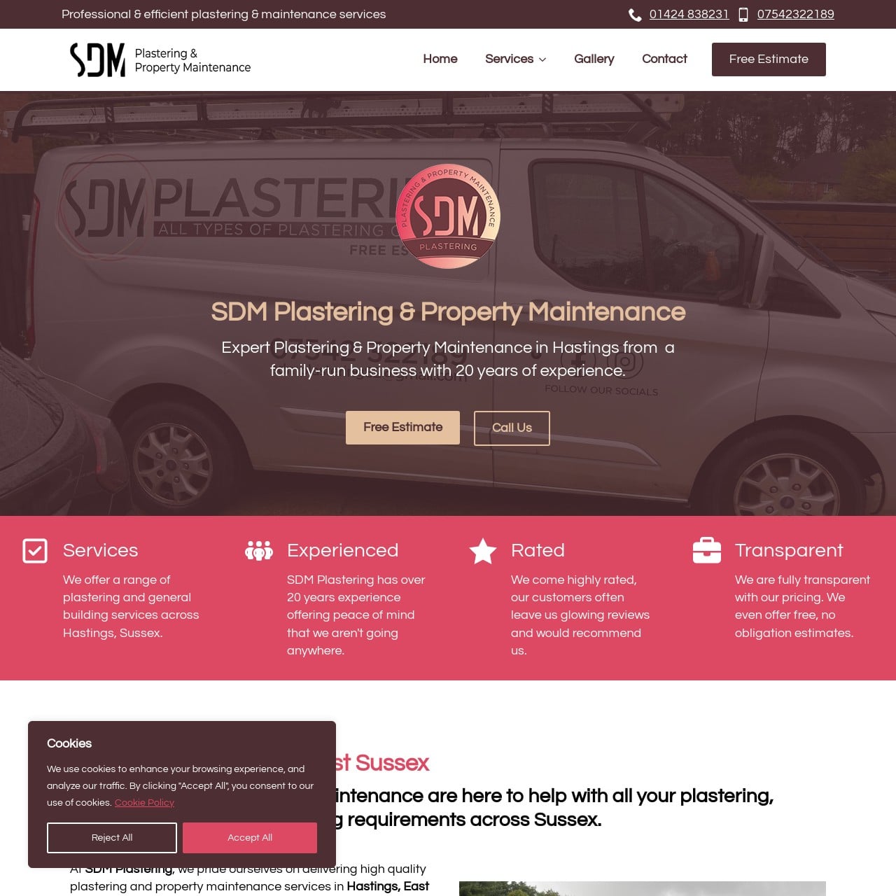
We developed a comprehensive website featuring detailed service pages designed to inform and engage potential clients. The site includes clickable phone numbers for immediate contact, strategically placed call-to-action buttons, and lead-generating forms to capture visitor information effectively. The website is SEO-optimized, ensuring high visibility on Google, and is linked to SDM Plastering's existing social media pages.
The Outcome:
The new website has transformed SDM Plastering's online presence, making it easier for customers to find and interact with their business. The enhanced digital strategy has led to an increase in inquiries and bookings, leveraging their online content to generate leads and convert visitors into customers.